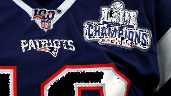
The New England Patriots unveiled a new uniform for the upcoming 2020 season. And while it has some great looks to it, there are some unlikable elements, too.
Well, there’s no wrong answer here because it’s a matter of preference. But the New England Patriots‘ new uniforms are interesting.
In some ways, they’re pretty outstanding. Yet there are some elements of the jerseys that are a little beyond just questionable.
In case you missed it, New England announced the release of a new uniform for the upcoming 2020 season, which marked the end of a 20-year run under the jersey fans have come to know and love, as well as the jersey the rest of the NFL has come to respect. Perhaps it’s fitting the Patriots are moving on from that well-known look in the wake of quarterback Tom Brady leaving for the Tampa Bay Buccaneers, signaling the end of his 20-year reign in New England.
Either way, it’s a new era. And it seems like the new era will showcase a home jersey influenced by what the Pats donned during the league’s Color Rush campaign of not long ago:
"Starting this season, the 2020 blue home uniforms are mostly identical to the “Color Rush” uniforms, with small tweaks made to the fonts on both the numbers and nameplates and red, white, and blue color-blocked socks making their debut. The navy-on-navy combination is then complete with bold red and white stripes on the pants and the sleeves, where the Patriots’ “Flying Elvis” logo is featured prominently."
And in case you were wondering what they’ll look like:
Neat, navy, New England.
— New England Patriots (@Patriots) April 20, 2020
📷: https://t.co/CiSXl5kXce
The trim around the new number font looks sharp, particularly on the home uniform. And while the Color Rush era of Thursday Night Football wasn’t overly popular or sightly, the blue-on-blue scheme actually looks pretty good in this case. The Patriots are one of only a few teams whose Color Rush uniforms weren’t wholly disastrous.
Yet there are more than a few elements of this uniform that aren’t so pretty.
Case in point, the shoulder stripes look out of place and excessive. Particularly with the “Flying Elvis” logo prominently displayed. While it looks bad on the home blues, the road white jersey doesn’t look good at all with those stripes. Simply getting rid of it would have been a much better touch.
And to be honest, switching from the silver helmet to an all-white helmet would have provided a sharp look.
Now, there’s a bit of an argument paralleling New England’s jersey release about bringing back Pat Patriot into a more prominent role. But as far as the helmet goes, a 2013 league rule still mandates teams use only one helmet over the course of a full season. They’re not able to switch, even for throwbacks.
Sorry, Pat. Maybe that’ll change sometime soon.
Granted, the Patriots could feature Pat Patriot as a full-time helmet, but that might be a little too over the top. It’s fun to reminisce with those classic red throwbacks donning Pat Patriot. But let’s not get too carried away here, especially considering the Flying Elvis is still a sharp look and one of the league’s best.
Either way, if you like what you see and want to be the first to add to your Pats collection, the team’s store is the first place to look.
